Iain Wallace
16th November 2018 - 3 mins read
W

ell, at Thirty Seven we believe in making content creation as simple and efficient as possible.

Sometimes this involves adopting the latest technology to incorporate interactive games, contests and podcasts into corporate marketing strategies.

And on other occasions it can mean revisiting the tools we have used for years – like Microsoft Word – and finding ways to do things that little bit better.

So in this blog we thought we’d share some of the Word tips and tricks that our content creators love.

Tip 1 – Filling the gap

How many times have you been preparing content in Word when not all the information is immediately available? You still want to do the ground work on the document and check the layout so you need some filler text. There’s only so many times you can repeat the words ‘blah blah blah’ across your document before it looks a bit silly, so for some more realistic looking holding text you can ask Word.

For paragraphs of random text, simply type =rand() or if a bit of Latin is more your thing you can get the same by simply typing =lorem(). The standard is three paragraphs but place a number between the brackets and you’ll get the equivalent number of paragraphs of filler.

Go try it now and see what you get…

Tip 2 – Losing it

It’s very easy to lose your place when editing various sections of a document, especially when you are being continually side tracked by telephone calls, urgent emails and impromptu meetings.

When you finally get back to the work you set out to do, using <Shift> + F5 will allow you to cycle directly to the spots that you have edited most recently. Using the same shortcut on a newly opened document will put you straight back to the location where you were most recently working, allowing you to dive straight back in before the phone rings again.

Tip 3 – Repetitive strain

If you find yourself repeatedly dipping into certain words or phrases in your content, such as the sign-off at the end of blog posts, the clipboard panel could be your answer.

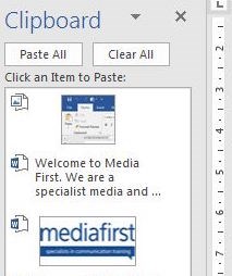
Open the panel using the small dropdown arrow next to the clipboard and the items you copy will stack up one by one, up to a maximum of 24. This gives you an always available list that you can pick from with a single click at any point in your document.
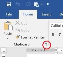
Even after you close down Word completely the full list is still there the next time you open a document.
Tip 4 – A ‘case’ in point

When consolidating background documents written by different authors you can save hours furiously editing or retyping erroneous upper and lower case letters by using the ‘Change Case’ button.
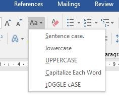
This button allows you to change entire sections of text from upper to lower case and vice versa as well as providing options to capitalise the first letter of each word and so on. What’s more, selecting your text and using <Shift> + F3 will allow you to do pretty much the same thing by toggling through the different case options until you’re happy.

Tip 5 – Not a paintbrush

Format Painter is another supremely handy tool when gathering and combining content from different sources. Far from anything to do with painting as the icon suggests, this button actually allows you to reformat huge swathes of text into your chosen style.
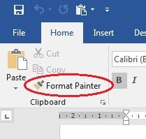
Select some text that’s in your preferred style. Hit the ‘Format Painter’ button and then drag your mouse over the separate section of text that you want to re-format to your chosen style. Quick, easy and a definite time saver.

We love the fact we are still finding out new things about a programme that has become an integral part of daily life for so many of us for so long. What Word features could you not live without?


At Thirty Seven, we offer content and design services to ensure your campaigns reach the right audiences at the right times. Our journalist led approach ensures your content is interesting, engaging and informative so you gain brand awareness and engagement whether it is social media content or a whitepaper.  

Marketing

Our guide to copywriting jargon

Adam Fisher 16th May 2018 — 7 mins read
T

wenty years down the line these terms are second nature to me, but I have to keep reminding myself that to many others they are a mystery.

Content production, like any other industry, has words, phrases and acronyms which while meaningful to those working in it, mean nothing to those outside.

Of course, we don’t use these terms in our content (we are still on a mission to eradicate all jargon from content), and we try to avoid using them when talking to clients.

But we thought it would be fun to take you through some of the frankly, often bizarre, and sometimes morbid terms we use and explain what they mean.

So here is our guide to copywriting jargon:


Above the fold – Traditionally this referred to broadsheet newspapers, with the top half of the page being above the fold, and therefore being the most prominent place for an article. It is now a term that is used in web design, referring to the part of the page visible without scrolling.

Blurb – The blurb is similar to a byline (see below). It is a brief introduction to the author that follows the headline.  If you look at our magazine In This Issue you will find some short text on each main article which details who wrote the piece and their experience.

Byline – The byline on a piece of content gives the name of the person who has written it. But it is not really about giving credit to the author. It is more of a tool which adds legitimacy to an article. For example, if you looked up the author of this post, you will see that I should know what I am talking about. When the byline is from maybe a senior leader in an organisation, or a particularly experienced writer, it can play a role in encouraging the reader to keep reading. The byline has evolved in recent times and will sometimes include a small bit of background on the author, or perhaps a Twitter handle so that readers can continue the conversation. 

Churnalism – Not a phrase you would hear at Thirty Seven. This refers to the practice of churning out content and articles rather than producing fresh, original and well-researched material.

House style – This refers to an organisation’s rules for writing, spelling and presenting content. For Thirty Seven, for example, one of the house rules is that numbers one to nine are always written out. In my experience, particularly from working in newspapers, any attempt to move away from house style is often met with profanities from editors and a stint in the naughty corner.

Greek – This is what we call the nonsensical text used when we are designing the layout for some content and the real copy is not yet available, even though it is actually Latin. You will probably have seen it at some point starting with ‘Lorem Ipsum’. This dummy text has more-or-less normal distribution of letters allowing the design to look complete so that it can be shared with a client. 

Gutter – No, not a reference to tabloid journalism. This refers to the white space in a magazine where two pages meet. It can also refer to the white space between text columns.

Hook – Hooks are a crucial component of effective content. These are the bits which keep your readers interested and engaged. They may be unusual facts, emotive examples, eye-catching statistics or perhaps posing a question the reader wants answered. Essentially, anything that encourages someone to keep reading the content is a hook.

Kerning – This may sound like some slightly obscure Winter Olympics sport, but kerning is actually the process of adjusting the process of space between letters.  I’m told by our designer that this is actually an ‘art’. But I write the words around here and I would describe it as a way of adding some polish to the design and improving legibility. Kerning can play a key role in eliminating orphans and widows, which sounds a lot more brutal than it actually is (more on those terms soon).

Kicker – This helpfully has a few different meanings when it comes to content. Traditionally, it has referred to a line above a headline which reveals something about the content – a sort of headline on the main headline.  More recently, it has also come to mean something surprising or poignant that is used to end a piece of content.  So if you hear us talking about a kicker, we could be discussing something at the beginning of a bit of content or something at the very end – helpful.

Orphan – One of the content world’s more morbid terms and something that is often confused with a ‘widow’. Even by those in the industry. It refers to a single word which appears at the top of a column or page. It is considered a villain of typography as it causes poor horizontal alignment at the top of a column or page. The key to remembering the difference is that an orphan is alone at the start, while a widow is alone at the end. Dark.

Pull quotes  A pull-quote is a strong, attention-grabbing quote, which has been, well, ‘pulled’ from the main text to add some visual flair to lengthy articles and make them more appealing to readers. Ideally, they are short, direct quotes, used to break up large sections of words and encourage the reader to keep going.

They are sometimes also called ‘callouts’ – but not by us.

Sidebar  This one more or less does what it says on the tin. It is a short article in a magazine or on a website sitting next to next to the main piece, which contains additional and supporting information  

Spike – Hopefully you won’t get to hear us use this phrase. It refers to a decision not to publish a piece of content or an article.

Standfirst – This is the term given to a brief introductory summary often used on longer forms of content. Its role is to give the reader an overview of what they will find in the rest of the blog or article and encourage them to invest their time in continuing to read. Generally, a standfirst will just be a few lines. Brevity is considered key.

Strapline – A strapline in print terms is a headline beneath the main headline, written in a smaller font, and used to give the reader further teaser information about the article.

Subheads – Subheads are the little headlines, usually one or two words long, that you will see scattered across longer forms of content. They serve a dual purpose. Firstly they break up the content making it appear less daunting for the time-pressed reader. Additionally, they make it easier for people to scan content to get a good idea of what it is about.

Teaser – This refers to a few lines of copy designed to encourage a reader to find the rest of the article. A printed magazine, for example, could include a teaser on the first few pages for a piece appearing further back in the publication.   


Tracking – Similar to kerning, but tracking is the process of adjusting the spacing throughout an entire word. Once kerning has been used to get the spacing right between each letter, tracking can be used to change the spacing equally between every letter at once. Clever hey? Still not an art though. (Stop picking fights with our designers Adam – Ed)

Widows – Another bleak term and something which is very similar to an orphan.  It refers to a short line – usually a single word - at the end of a paragraph or column. This is a design problem in printed content as it leaves too much white space between paragraphs.

WOB – Quite simple this one. It means white on black and refers to white text on a black or other coloured background.


At Thirty Seven, we offer content and design services to ensure your campaigns reach the right audiences at the right times. Our journalist led approach ensures your content is interesting, engaging and informative so you gain brand awareness and engagement whether it is social media content or a whitepaper.

Adam Fisher
20th July 2018 - 5 mins read

Every company wants to be an authority in their sector - those that engage the media usually are

Media First designs and delivers bespoke media and communications courses that use current working journalists, along with PR and communications professionals, to help you get the most from your communications plan.